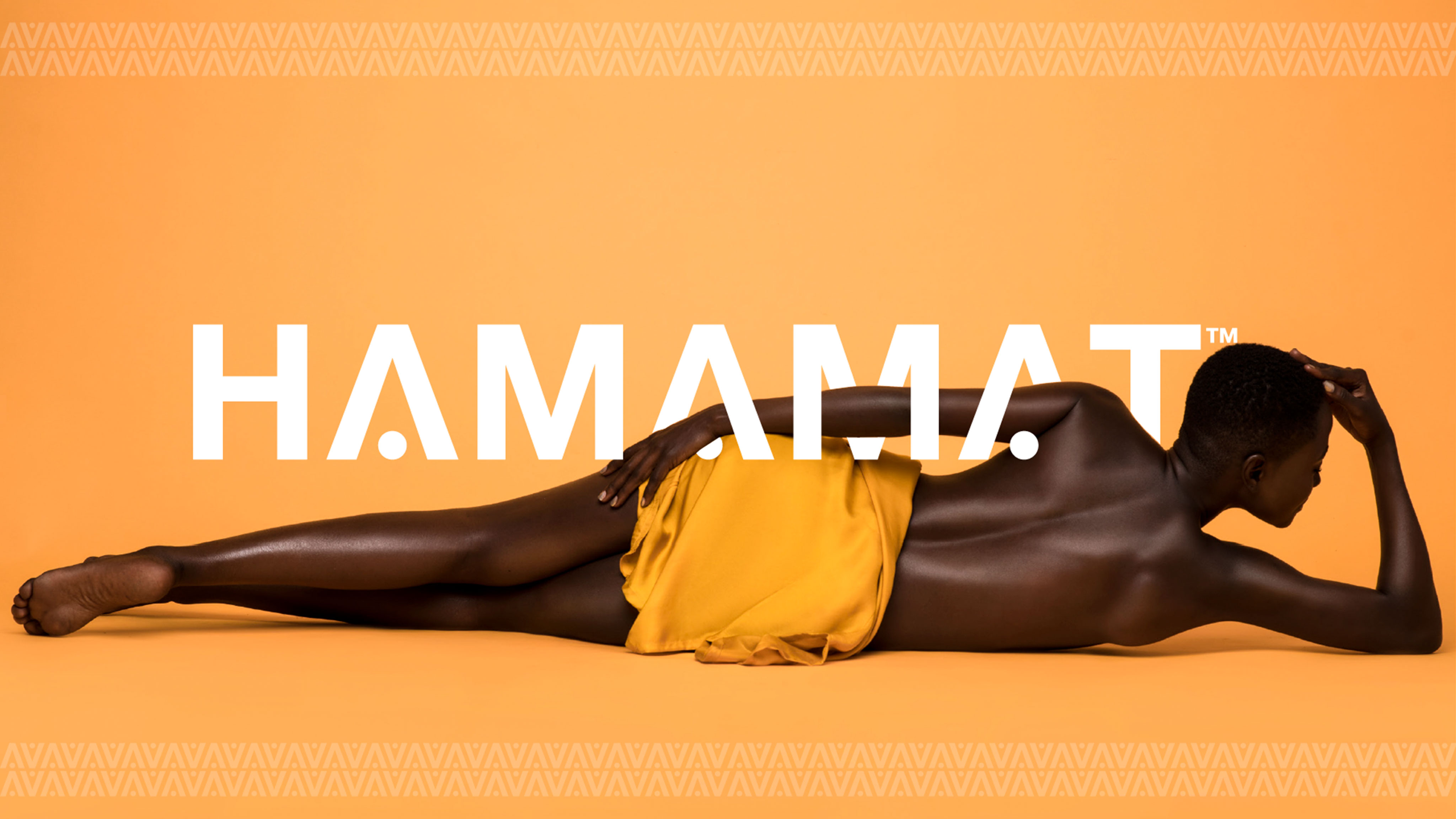
Hamamat Brand Identity & Website
The Brief
Requesting a timeless logo design to represent the Hamamat skincare products.
Challenge
It’s a highly competitive market with a wide range of target audiences, thus challenging to address all the needs of the brand using typography only. Picking up a perfect typography workflow and enhancing it to make it more unique and established the individuality as a brand.
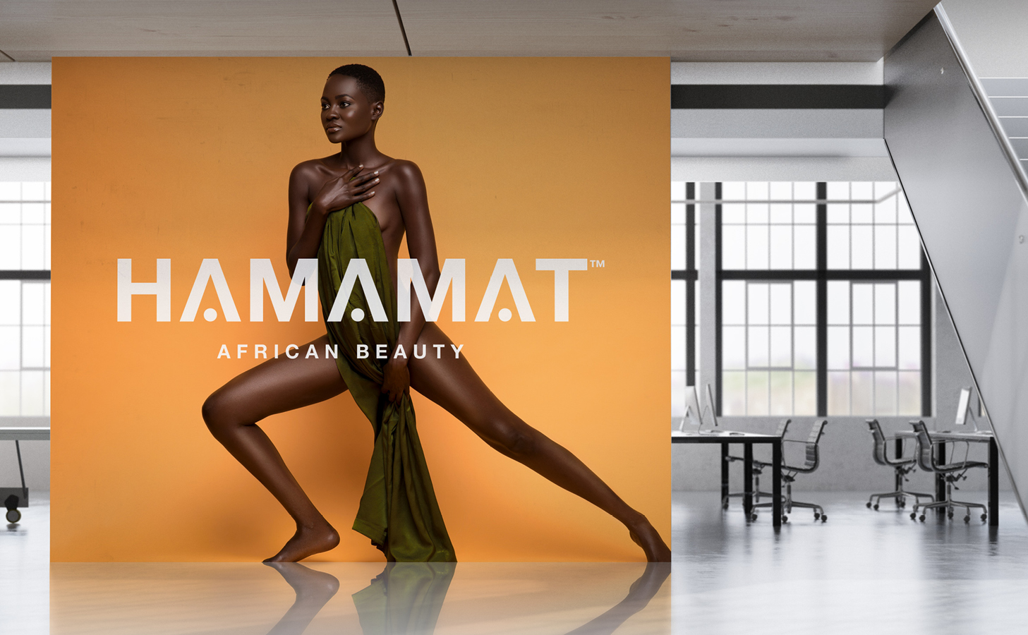
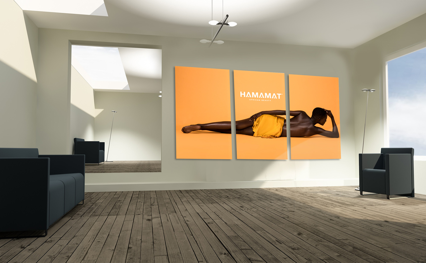
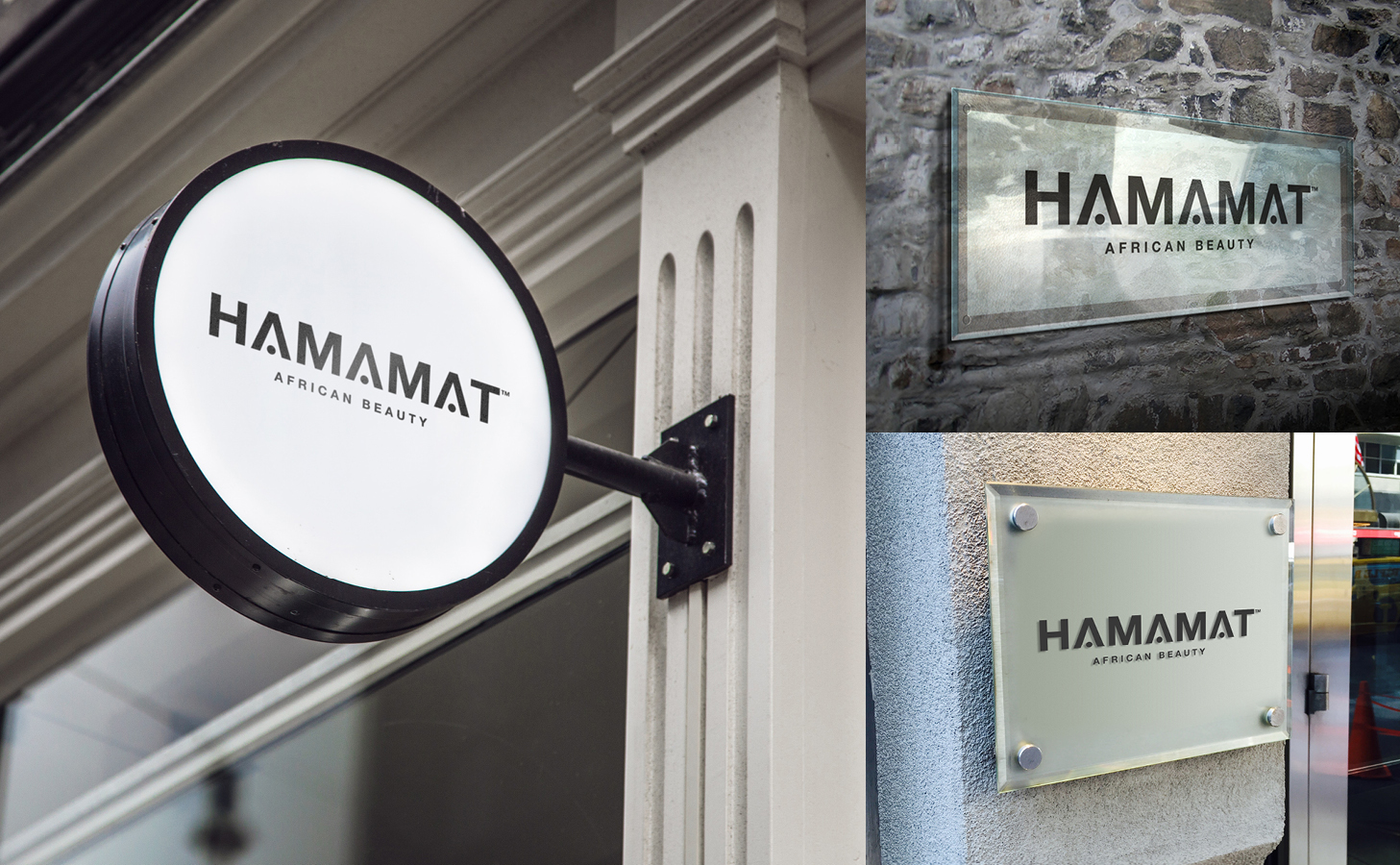
Solution
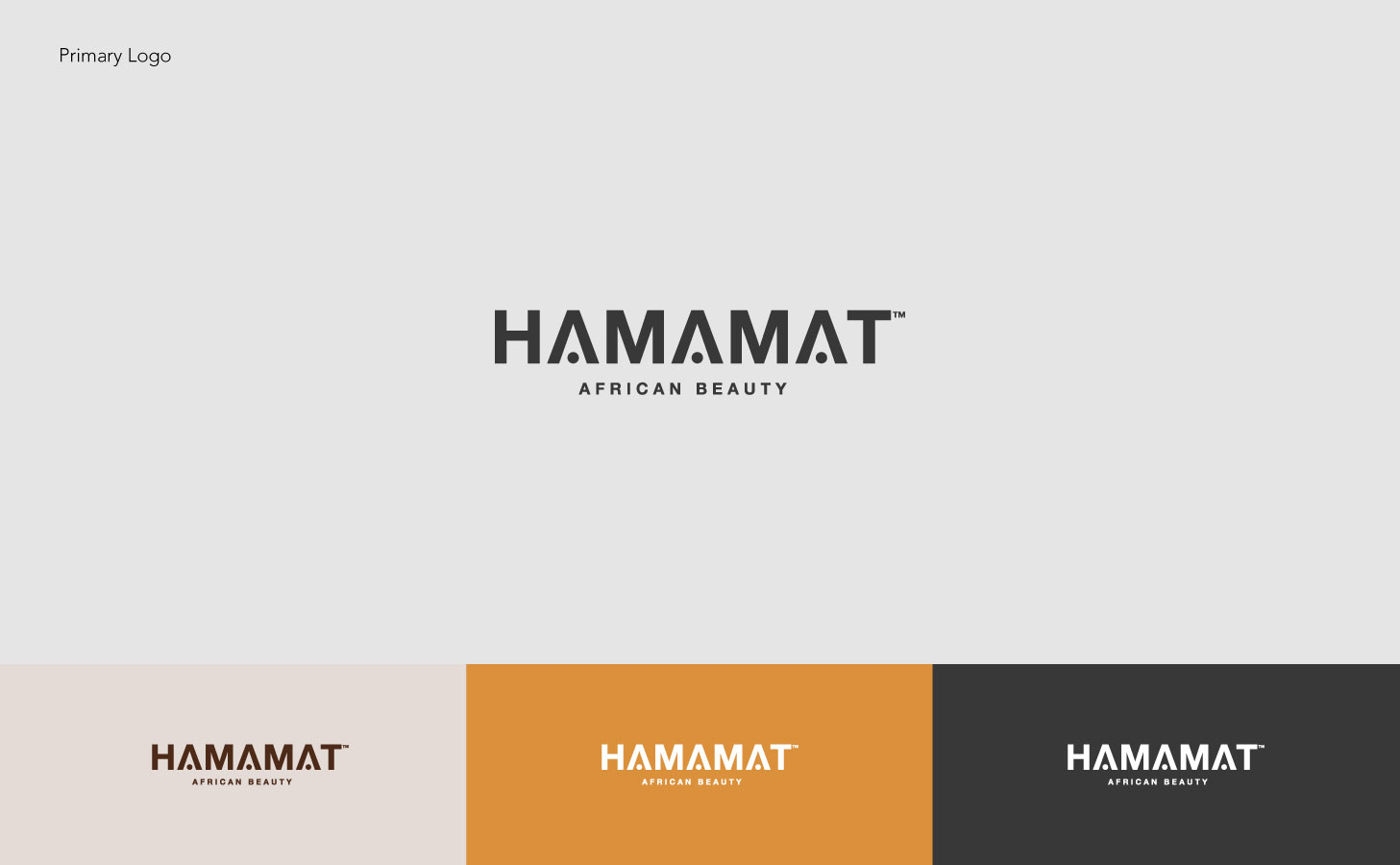
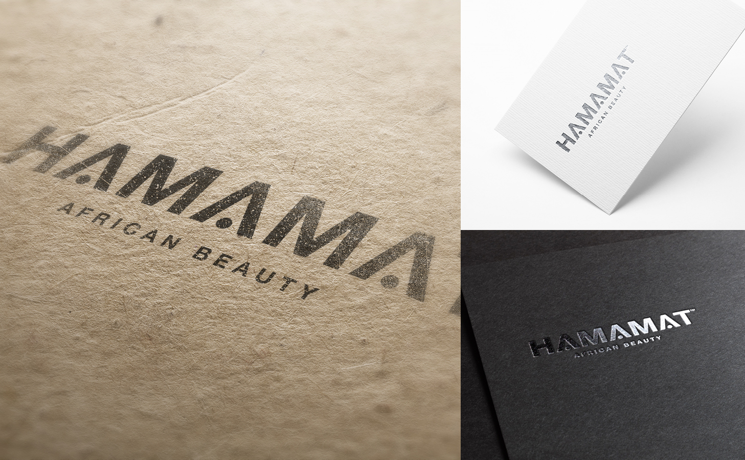
We created an elegant brand that conveyed the spirit of the brand and its essential characteristics. The result is inviting and minimalistic, with crafted typefaces formed by the brand name, always showing their feminine spirit. A spontaneous brand, without losing sophistication.
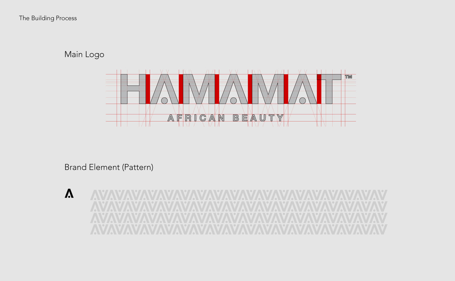
Rational
The brand logo is a perfect balance of geometric rhymes. It looks solid, clean and pretentious at the same time. The brand embraces both magnificence and simplicity, represented in a unique typography exercise. Our graphics solution is focused on connecting “joy”, “sincerity” and “simplicity” with all the mentioned attributes, interpreted in symmetrical, an elegant and bold typography. This brand logo not only to create a specific and easy-to-recognize brand but to express the neatness of their skin care cosmetics products. Close to nature and full of femininity, Hamamat’s brand identity uses the simplified and stylized typography to evoke the brand’s freshness and full of energy


Charith at 2:58 pm, March 26, 2018 -
Please let me know your thoughts, Thanks in Advance
Comments are closed.